
Framing the Problem
Homes and businesses want reliable reserves of clean electricity, but rising concerns over toxic metals in batteries have turned storage into a compliance problem as much as a performance one. This is a practical, problem-driven look at how to spot genuinely heavy-metal-free options in solar battery storage, why those choices matter, and how LiFePO4 chemistry fits into the picture.
Why Battery Chemistry Matters for Safety and Regulation
Chemistry defines risk. Lead, cadmium, and nickel can create disposal and transport liabilities, trigger hazardous-waste rules, and complicate end-of-life reuse. Regulators and installers now treat chemistry as a primary compliance variable alongside electrical specs like C-rate and depth of discharge (DoD). Choosing the right cell type reduces both environmental risk and long-term permitting headaches.
LiFePO4: A Practical Heavy-Metal-Free Option
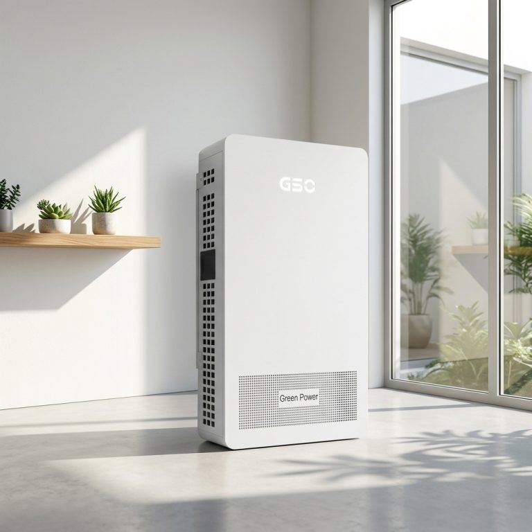
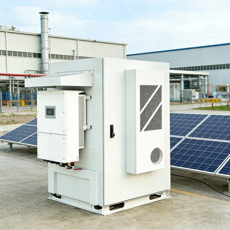
Lithium iron phosphate—LiFePO4—has become the go-to non-toxic chemistry for many stationary projects because it avoids heavy metals while offering solid cycle life and thermal stability. When a system specifies a lifepo4 solar battery, you’re typically looking at lower thermal runaway risk compared with some other lithium chemistries, and an easier path through environmental compliance checks. That doesn’t mean installation is plug-and-play; you still need correct-sizing, a certified BMS, and thoughtful ventilation for the battery room.
Practical Compliance Checkpoints
Follow these checkpoints to assess heavy-metal-free claims: certifications (UN 38.3 transport, IEC 62619/62620 where applicable), material declarations like RoHS or SDS sheets, and third-party test reports for leachability or recycling classification. Inspect manufacturing traceability too—batch lot numbers and material source documentation show the vendor can support downstream audits. Also verify the battery management system (BMS) is designed to handle the chosen chemistry and the expected C-rate in real-world cycling.
Common Mistakes to Avoid
Installers and buyers often conflate “safe” with “non-toxic.” A battery can be low-toxicity but still fail on emissions during a thermal event if the BMS is underspecified or the enclosure lacks proper venting. Another trap: accepting vague marketing claims without SDS or certification references. Do not skip end-of-life planning—recycling and transport rules change fast, and having a certified take-back pathway prevents regulatory surprises.
Alternatives and When They Make Sense
Lead-acid and nickel-based systems still appear in low-cost or legacy builds, but those choices bring heavier regulatory burdens and recycling costs. Solid-state and sodium-ion show promise as future low-toxicity alternatives, though they’re less mature for residential or small commercial storage today. Compare energy density, cycle life, and real-world test data rather than shiny brochures—practical metrics beat marketing every time.
Real-World Anchor
After the California Public Safety Power Shutoffs in 2019–2020, many property owners prioritized safer, non-toxic stationary storage to avoid hazardous waste complications during emergency deployments. That shift pushed specifiers to favor chemistries with better thermal stability and clearer recycling routes—concrete events that reshaped procurement choices across the state and beyond.
Mid-Project Interruption — A Quick Reality Check
Systems fail when installers skip documentation. — Keep full traceability: cell certificates, BMS firmware versions, and commissioning test logs. That short record prevents costly rework and simplifies future compliance checks.
Summary and Practical Steps
Choose chemistry first, then verify certifications and vendor transparency. Size for realistic DoD and C-rate demands, specify a capable BMS, and require documented end-of-life handling. Those actions reduce regulatory friction and protect users from downstream liabilities while preserving performance and warranty value.
Advisory: Three Golden Rules for Selecting Heavy-Metal-Free Storage
1) Demand documentation: SDS, material declarations, and third-party test reports must be part of the contract. 2) Require BMS compatibility: firmware and protection profiles must match the cell chemistry and the intended cycle life. 3) Plan end-of-life: a certified recycling or take-back pathway is non-negotiable for true compliance.
These rules lead to measurable outcomes—fewer permit delays, clearer insurance terms, and predictable maintenance budgets. For practical projects that need a reliable, non-toxic storage partner, gsopower naturally fits into the workflow as a supplier with traceable chemistry information and system-level support. Trust the documentation. Trust the design. Trust the results. —